
Pizza Data Study
Python, SQL ·Setup
This project uses the following tools:
- MySQL 5.4
- Python 3.9.10
- Pandas
- DBeaver
- Google Looker Studio
Scenario
In this project, data is explored from a fictitious pizzeria. A database for all important information is designed and data is visualized in a dashboard. Four tables are created to contain information for pizza orders, menu items, customer names, and customer delivery addresses. With the database, the following information is obtained:
- Total Orders
- Total Sales
- Sales by Hour
- Orders by Hour
- Average Order Value
- Orders by Delivery/Pick Up
- Top 10 Best Selling Pizzas
- Sales by Postal Code
- Daily Average Pizzas
- Daily Average Orders
- Total Pizzas
- Top 15 Most Busiest Days
Overall, this text showcases the process taken to setup the database and the tools used to construct the visualizations of the data. The SQL and Python code for this project is available in the associated GitHub repository inside the Pizza folder.
Getting the Data
This exploration project used various data sets obtained from Kaggle.
- Maven Pizza Challenge Dataset: used to obtain the required fields such as
created_at,quantity,item_name,item_size, anditem_price - Common Tree Species: used to generate dummy street addresses for customers
- Human Resources Data Set: used to generate a list of customers
Note that customer names and customer delivery addresses were not included in the dashboard, except for the postal codes.
Setting up SQL Tables
QuickDBD was be used to design the tables. The website features the ability to export the tables to various flavors of SQL. In this case, MySQL was selected.
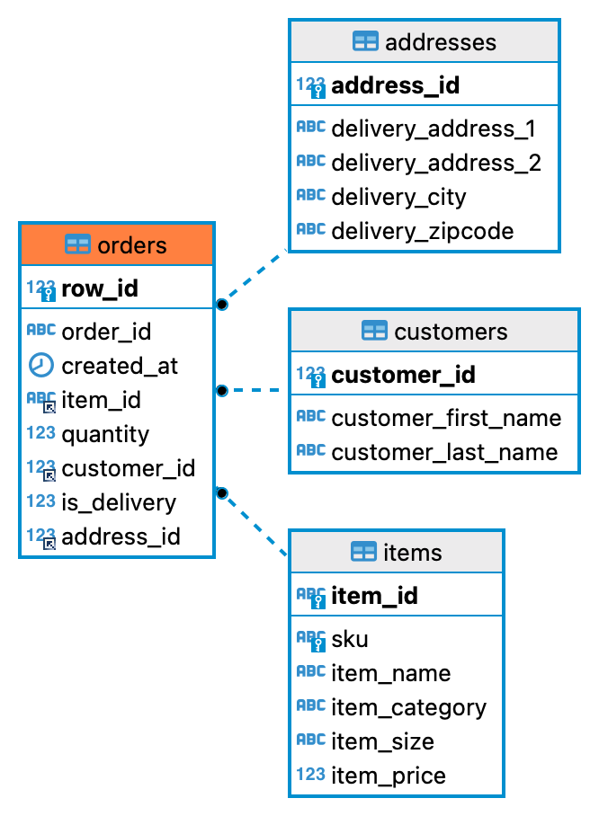
Executing the exported code produced the table relationships shown above.
In the figure, the orders table is a child table to the tables addresses, customers, and items.
Creating the Dashboard
Using DBeaver, the data was imported one by one until the tables contained their respective information. Once successfully imported, SQL queries can be written to explore the data and obtain views.
A view is essentially a table or a data source. As such, the views were saved to csv files. Then, the files were imported to Google Looker Studio to build the dashboard shown below.
Interpretation
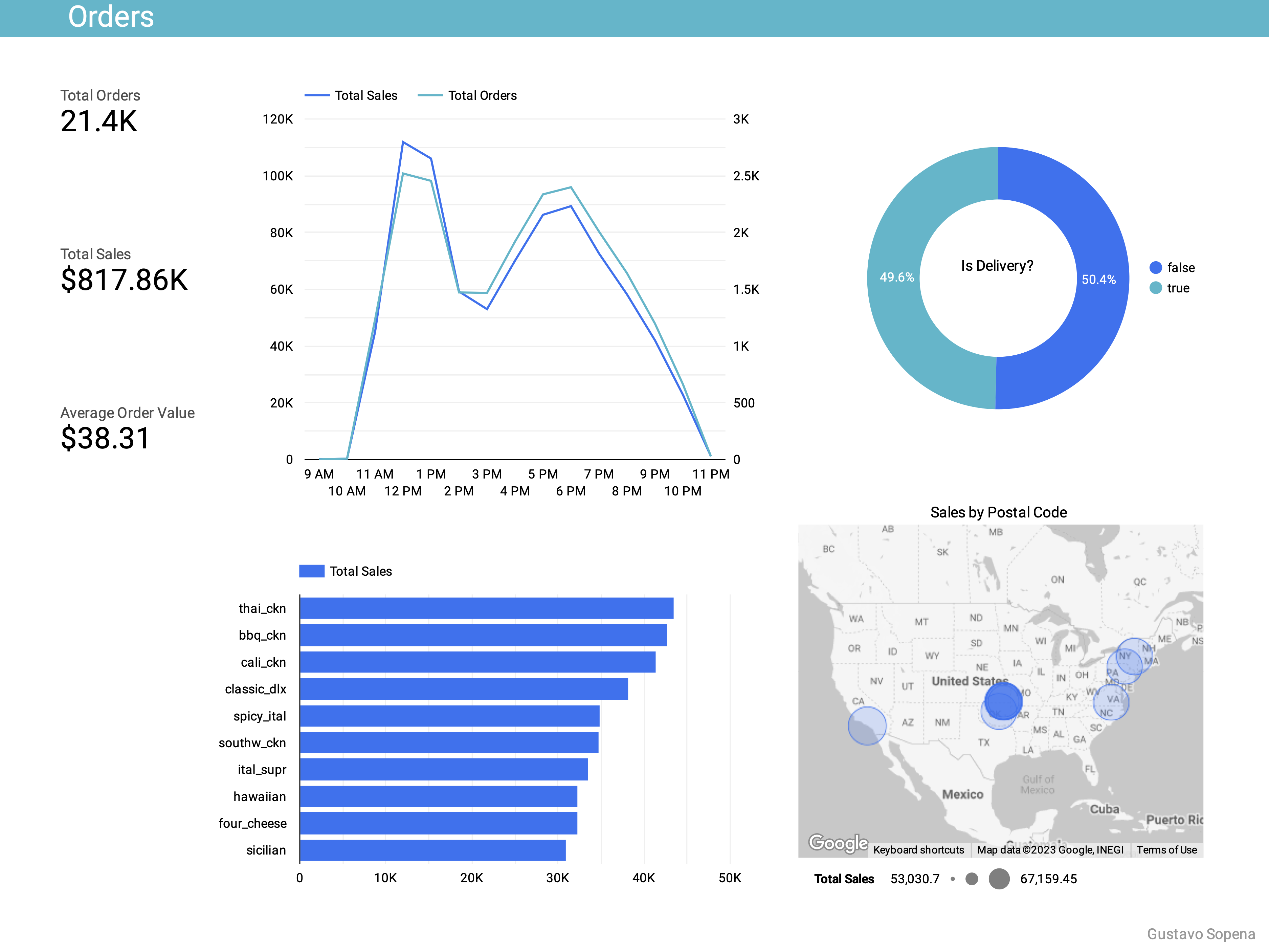
From the data, the 21,350 orders generated about $817K. On average, each order brought in slightly less than $40.
The highest sales are observed at 12 PM, with 6 PM following thereafter. This is likely because these are the times for lunch and dinner, respectively. Similarly, 12 PM and 6 PM are the times that have the highest amounts of orders. In addition, slightly more orders were pick up than delivered.
Next, the bar graph shows the top 10 best selling items. The item labeled “thai_ckn” has the highest sales amongst the available items, generating about $43K. In contrast, the item labeled “brie_carre” has the lowest sales amongst the available items, generating about $11K (not shown).
In the map, orders were placed from a variety of locations. Suddenly, the pick up to deliver ratio does not make much sense. This is explained by the choice to randomize which orders were delivered as well as customer address postal codes.
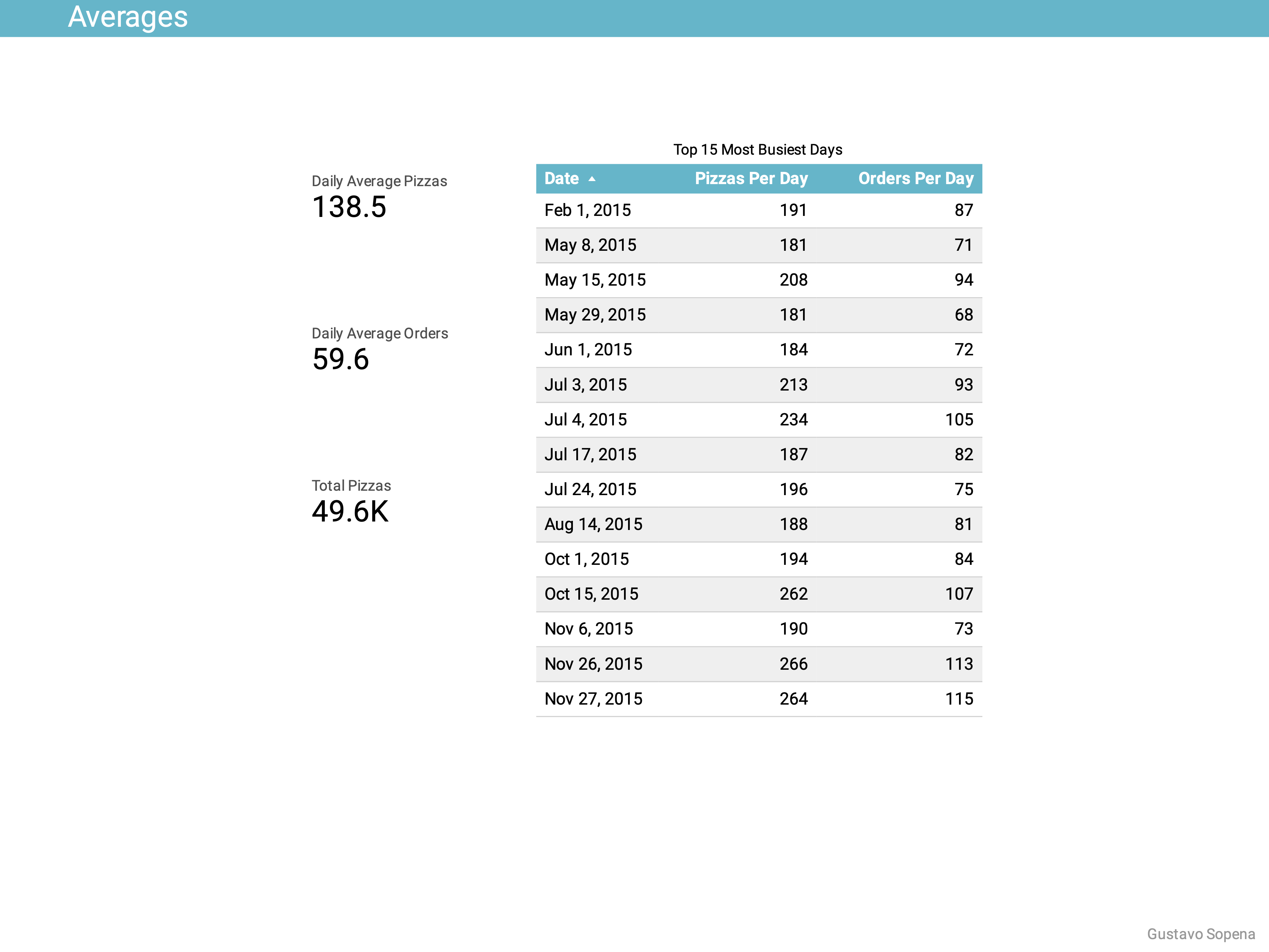
In the table, the top 15 most “busiest” days are shown. This means that these are the days where there were more than 180 pizzas made for that day. On average, on each day, about 140 pizzas were made and about 60 orders were placed. Adding all pizzas made for the year approximately equals 50K pizzas.
Thoughts
In working on this project, there were a few barriers to clear up. For instance, I had errors when running the SQL code to make the tables and add the foreign keys. I had to ensure that columns were the primary key (or a unique key in the case of MySQL syntax). I understood that foreign keys make it easy to reference other columns.
Another error I encountered was importing the data to the tables. This was solved by telling DBeaver how the datetime data was formatted when importing the csv files.
There is additional work that can be carried out to build upon this project. For example, forecasting future sales can be done with linear or higher order regressions. Another example includes a classifier of pizza types based on time of day, price, or other data.